Research into the Ill Bloom wallets: statistics, graphs.
Table of Contents
Ill Bloom Wallet Analysis
Context
Ill Bloom is a wallet generation vulnerability that Coinspect Security discovered and that I helped research, see previous posts no. 20 and no. 21.
In this post, I’ll focus on some statistics and graphs for the affected wallets. More technical details on the PRNG brute-force aspects will follow in a later article.
Statistics
| Range | BIP39 language | Coin | Wallets | Used addresses | Total transaction volume | First activity |
|---|---|---|---|---|---|---|
| 128 bit (all) | EN | BTC | 795 | 986 | 8120.9 BTC, $100.1M | 2018-09 |
| 128 bit (all) | EN | ETH | 485 | 616 | ||
| 128 bit (all) | EN | LTC | 6 | 6 | ||
| 128 bit (MINSTD) | EN | BTC | 133 | 139 | 9.1 BTC, $0.3M | 2018-09 |
| 128 bit (MINSTD) | EN | ETH | 29 | 29 | ||
| 256 bit (MINSTD) | EN | ETH | 6 | 6 |
Technical notes (click to unfold)
- Wallet search is not exhaustive in all ranges due to large search space.
- Primary search performed on BTC and ETH.
- MINSTD is a subset of the general search.
It’s important to note that this summary only covers wallets I found and verified first-hand. It therefore represents a lower bound on the actual wallets. Other researchers have found more wallets for coin types and variants that I didn’t search through, and there may be many more wallets hiding in unexpected configurations or blockchain usages. My address data for Ill Bloom is available publicly here.
Graphs
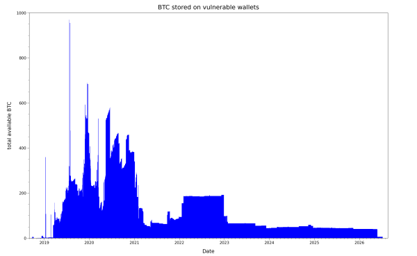
I’ve prepared some visualizations for discovered Bitcoin Ill Bloom wallets in my dataset, which are from weak 128 bit BIP39 wallet keys with an English wordlist. Ethereum wallets and other coins are not considered in this analysis.
Let’s start with the the amount of vulnerable Bitcoins on these wallets, graphed over the last 8+ years:
Here is the same view adjusted for BTC price on a given day, to better represent the money at risk:
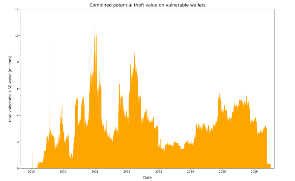
The two major theft events around 2026-05-27 and 2026-07-10 are visible as cliffs on the lower right corner of the graph, where the balance falls from about $3M to zero in two steps. A view of daily transaction volume in USD also shows them as big withdrawals (red):
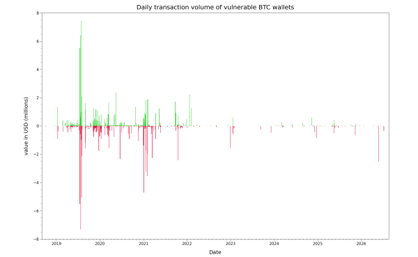
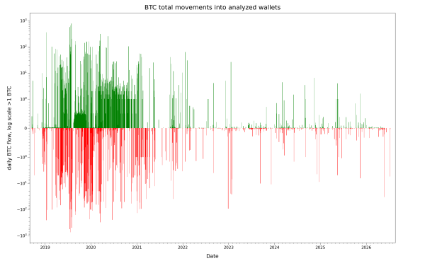
Showing these movements as USD instead of BTC is helpful as a normalization since the BTC price has significantly changed over the total time period of the graph. Rendered as pure BTC numbers, the theft events in 2026 appear a lot smaller in the linear graph of BTC movements due to the scale of previous activity in 2019/2020 in this range:
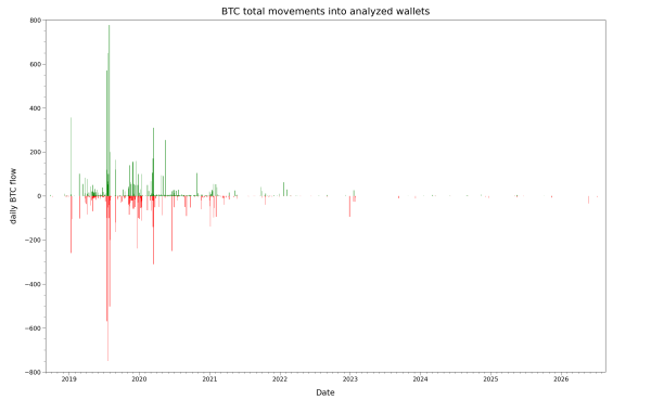
It is possible to bring them into view through a symlog scaling on the Y axis, which compresses different magnitudes of scale into the same picture at the cost of quick readability: