This is the second analysis article of the insecure Bitcoin wallet flaw in Cake Wallet from 2020/2021. In this iteration, we give an overview on usage statics and affected funds and present a number of graphs to visualize the overall usage.
Table of Contents
Introduction
Please see research update #6 and research update #9 for context on the Cake Wallet random number generator vulnerability.
To summarize, the Cake Wallet cryptocurrency wallet software relied on a weak Pseudo Random Number Generator (PRNG) to generate Bitcoin wallets, which is a catastrophic design flaw. Wallets created this way are permanently and irrevocably insecure, exposing all wallet private keys and details to direct thefts and analysis by anyone. The software vendor publicly disclosed this vulnerability in May 2021, released a patched software version and asked users to urgently transfer their affected funds to different wallets. A large majority of users did so, but not all.
During our research in late 2023, we managed to discover a previously-unreported shortcut and recompute the weak private keys of these wallets. To our surprise, we then discovered that a small portion of funds still remained, over 2.5 years after the vendor’s widely published vulnerability disclosure. This created a number of headaches for us and required some extra disclosure-like efforts, despite the fact that the underlying security issue had been public for years.
In research update #9, we explained the technical details on why the broken wallets are extremely insecure and quick to recompute via the PRNG algorithm with just 20 bit of entropy, as well as the likely reason why this went unnoticed for a long time. In this research update, we’re presenting some historic usage statistics across all discovered weak wallets.
Usage Analysis
Wallet Statistics
Looking for actual public usage, we found:
- 8757 unique weak main wallets
- 12999 unique sub-accounts (not counting change addresses)
- 13401 unique addresses (counting change addresses)
- ca. 51600 transactions involving these addresses
About 548.9 BTC of funds have moved through them between 2020-11-30 and 2024-10-10.
This data is based on a search via a public bitcoin address collection from ca. 2024-10-02, and should be a good total approximation due to the limited Bitcoin usage variations offered by the vulnerable software, compared to other wallet vulnerabilities where we can only search a subset of variations and will likely miss some funds.
Technical details:
- Electrum Seed with 12 words
- Seed hash prefix
0x100 - Segwit P2WPKH
bc1qaddress m/0'/{c}/{a}path format with{c}change (0or1) and{a}subaccount- Compressed pubkey format
Money flows
By searching Cake Wallet victim Bitcoin addresses against public Bitcoin address usage and combining the discovered wallets with public blockchain transaction information, we can generate an aggregate view of the money transfers in and out of the weak wallets over multiple years.
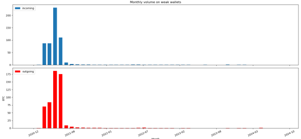
The first graph shows a monthly view on the incoming and outgoing funds. As you can see, there is a significant amount of value transfer over these wallets in the first half of 2021. As expected, the initial flank of this corresponds to the introduction of the vulnerable Cake Wallet versions, and how they gradually got more adoption and usage. In the middle of May 2021, the vulnerability disclosure by the vendor leads most users to switch to other wallets and regular usage plummets, which is also reflected in the graph. Notably, there’s still a long tail of low-level use after this point, which we’ll take a closer look at soon.
Here is a second view on the same data, but with a daily record granularity of the incoming and outgoing transfer value across all known weak wallets:
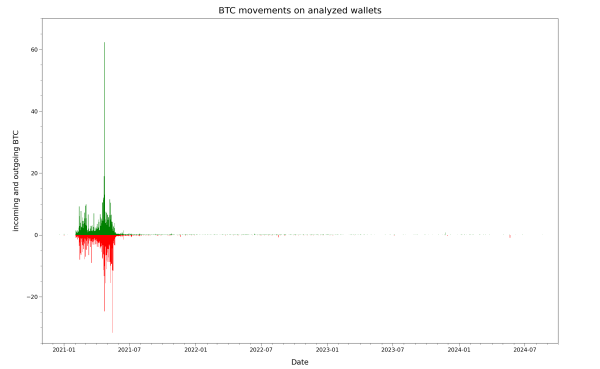
Given the linear Y-scale of the previous graph, it is primarily useful to judge the volume of moved funds and spot peak events, and underpins the previously mentioned analysis of the initial widespread usage phases. Due to the different orders of magnitude in the transaction amounts, which range from less than a dollar to more than a million dollar individually in the underlying dataset, plotting them this way quickly runs into visual limitations. In particular, a few high-activity days will define the maximum range, squeezing the transfer volume details on less active days (after the initial busy period) into a narrow pixel range and therefore making them very hard to recognize.
After experimenting with some alternative ways to plot this variation in a single graph, here is the same data in a special combined linlog Y-axis graph that combines both linear (in the < 1 BTC Y-axis region) and logarithmic (in the > 1 BTC Y-axis region) areas on the same Y-axis, while keeping the X-axis a linear time scale. This unusual view brings out additional details and shows the smaller activity details after mid-2021 more clearly:
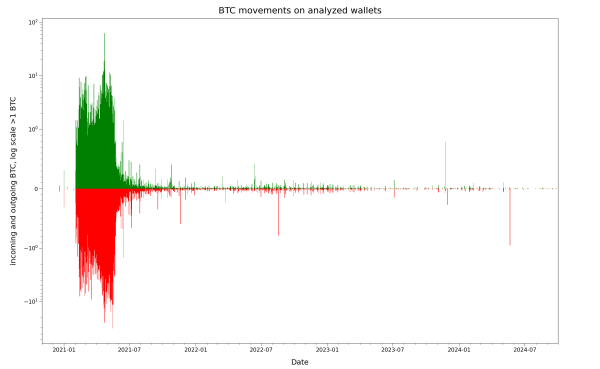
As you can see, the majority of owners of the vulnerable wallets have slowed or stopped their usage at some point between the vendor disclosure and the end of 2021. A minority of users did not change their behavior though, and continued to use their vulnerable wallet, perhaps unknowingly playing with fire. Plotting the total amount of funds that were sitting on the weak wallets on any given day gives more insight into this situation:
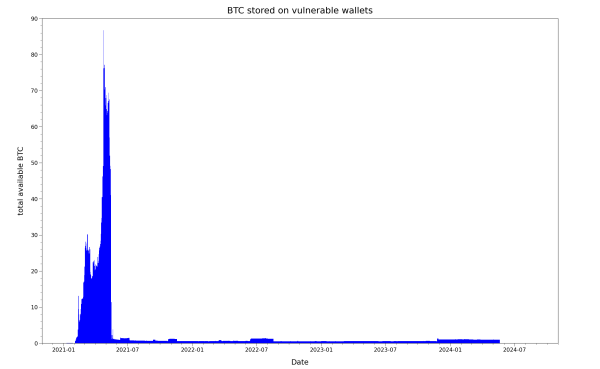
The most noticeable feature is the strong peak in mid-2021 with over 88 BTC, and the corresponding steep slope after the vendor disclosure that represents a mass exodus of funds. On a second look, the fact that some money always remained on the vulnerable accounts is also striking. To us, this suggesting that wallets were not swept of their funds by attackers for multiple years, at least not in a noticeable greedy way.
Since the Bitcoin price has changed a lot of the years, here is an adjusted view that graphs the daily equivalent value if the Bitcoins were stolen and sold immediately, using the relevant Bitcoin price on each day:
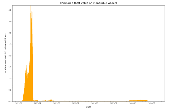
(Adjusted for daily BTC price, not accounting for transaction and processing fees)
Let’s take a closer look at the vulnerable Bitcoins, again via the special linear & logarithmic view of the same data:
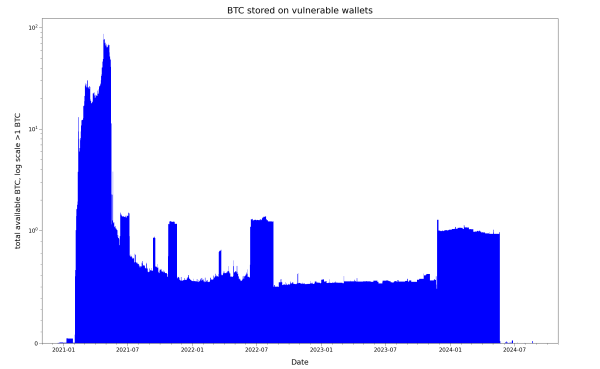
This gives a better overview of the amount of vulnerable funds that remained on the wallets. We’ll go more into the research and disclosure implications and headaches we faced with this situation in a future article.
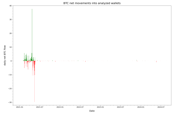
Before we conclude this analysis, here’s yet another view of the same situation. The previously shown daily transaction view with both incoming and outgoing volumes on the same graph can be very busy, making it hard to visually distinguish where money moved in or out. Here, we’ve calculated and graphed on the daily net difference between the incoming and outgoing funds on a given day. A net positive day is green (more incoming), whereas a net negative day (more outgoing) is red. This can help isolate unusual events of funds going in or out, which maybe benign (triggered by the genuine owners) or malicious (triggered by the attack to siphon off funds):
Special linear & logarithmic view again:
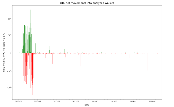
We assess most of these to be benign and associated with large individual transactions or expected group behavior. From 2024-05-21 onwards, the larger outgoing transactions are mostly malicious, as we’ll explain in a future article.
Summary & Outlook
In this research update, we’ve presented details on the real-world usage of the weak cryptographic Bitcoin keys generated by Cake Wallet. Over several months in 2021, millions of dollars worth of Bitcoins deposited into thousands of insecure wallets were acutely at risk of remote theft without any victim interaction. In a series of graphs covering data on all known victims, we’ve outlined how the usage of vulnerable wallets and risk profile of affected users as a group has changed over time, quantifying the real-world impact of this vulnerability. It’s unusual to be in the position to build a comprehensive view of a severe wallet flaw in this way, so this was interesting for us to document, although this type of data research is often time-consuming.
We will discuss other details of this work in a future research update iteration.